Qu’est-ce que c’est?
In a previous post, I cross-examined the data to determine if the sluggish sales we’ve been seeing in the Vancouver market can be pinned on the “uncertainty” created by the on-again, off-again trade war with the United States.
When questioned on the stand, I couldn’t find sufficient evidence in the data at hand to convict uncertainty as the culprit beyond a reasonable doubt.
I won’t recap the entire post here, but one of the most damning pieces of evidence I surfaced, was that a number of real estate markets in Canada are not experiencing the same slowdown in sales as Vancouver and Toronto.
In fact, many of these markets are seeing sales that are above their 10-year seasonal averages.
This fact raises the natural question: how can it be that uncertainty only seems to negatively impact sales in markets like BC and Ontario, but not other parts of the country?
In this post, I try to (finally) get to the bottom of this question.
A warning to all readers: if you don’t like looking at a lot of plots, you might want to skip to the conclusion.
For those of you who enjoy wading through a mountain of plots, this one is definitely for you.
What are we even looking for?
To start off, it makes sense to provide a stylized example of what we’re searching for in the data as evidence of a causal relationship.
If we could somehow divine what the mystery variable is that is causing the slowdown in sales, a “smoking gun” relationship in the data might look something like this:
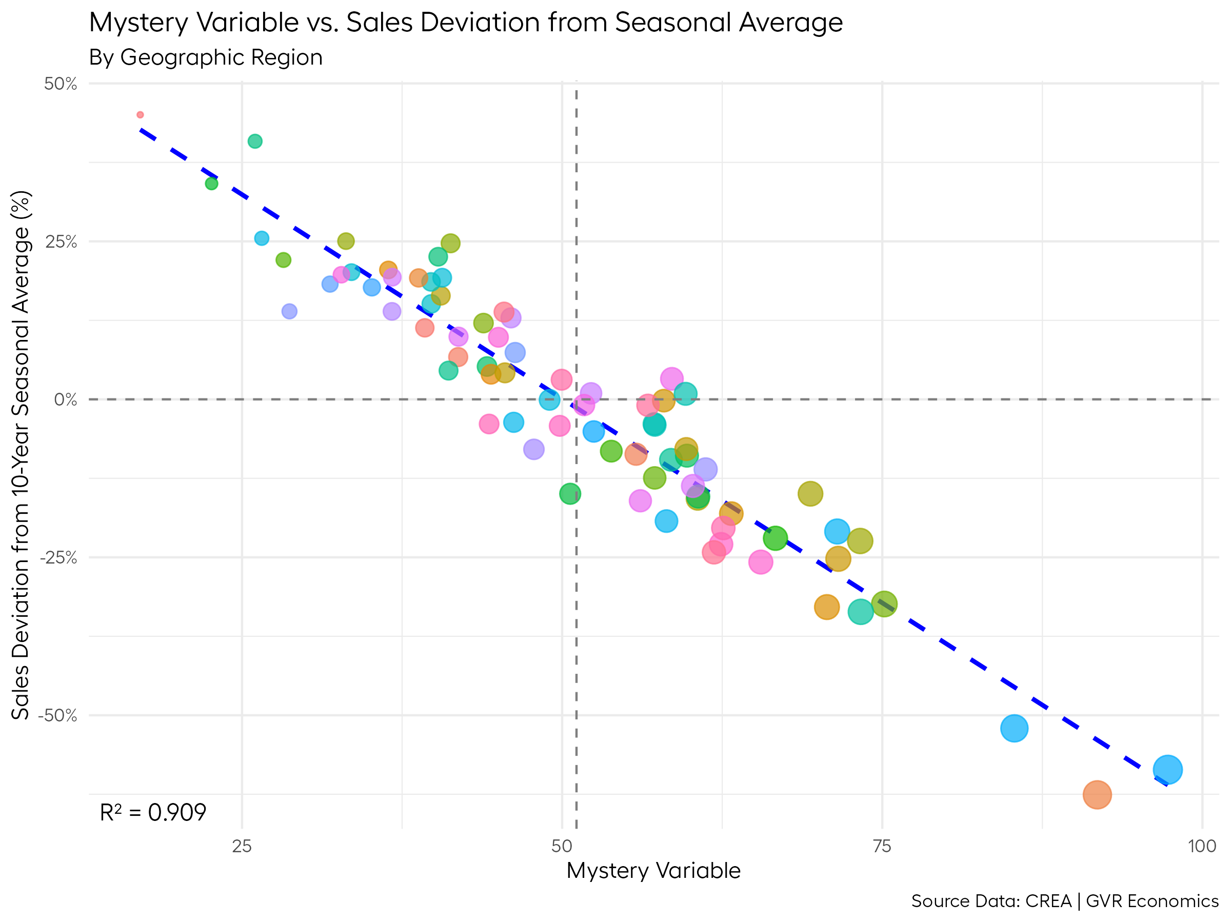
Note the exceedingly high r-squared value (0.909), and the way the data clusters tightly around the line of best fit.
In the wild, it’s pretty rare to discover relationships like this in the data, especially in the social sciences (i.e., economics) where we are always limited by the quality and quantity of data available to answer the question at hand.
And it’s always important to remember that a high correlation on its own does not equal causation.
With that said, if we were to find a relationship like this stylized example in real world data, it would give us a pretty good starting point to try and unravel whether the relationship is truly causal.
And that’s what I’ve set out to find in this post.
Point of reference
As the inspiration for the previous post on this topic, I noted how BCREA’s Chief Economist, Brendon Ogmundson, found a pretty strong relationship between the price level of homes across regions and slowing sales.
For reference, here’s the plot from my previous post re-creating Brendon’s plot, with my added twist of using the deviation of sales from their 10-year seasonal averages, as opposed to sales indexed to a fixed point in time (as in Brendon’s version).
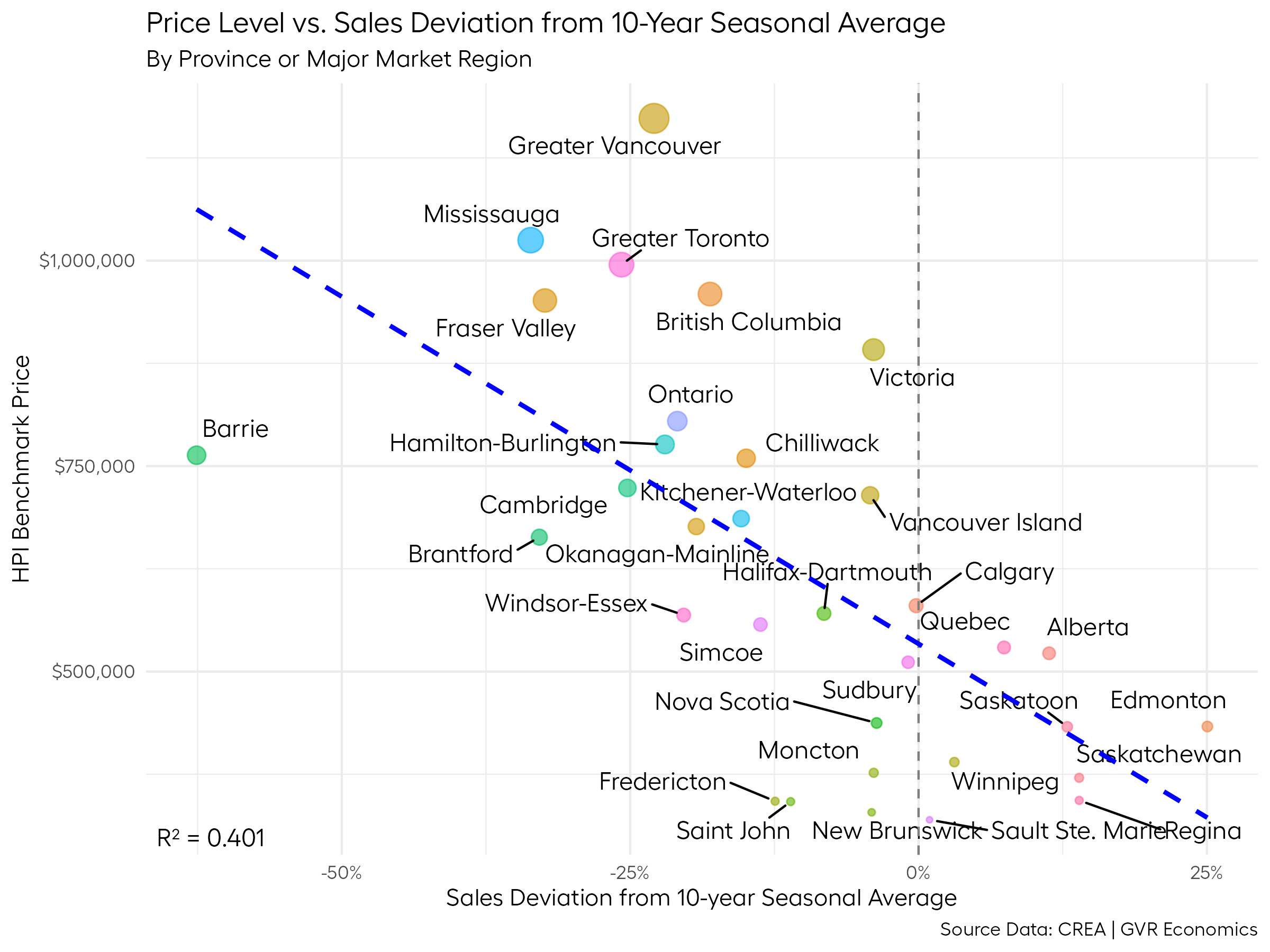
Looking back at it, it’s a pretty convincing plot with a reasonably high r-squared value (0.401). But as I pointed out in the previous post, the interpretation of the price level as causal leaves open a number of questions.
For example, why would the price level matter if what’s truly dragging down sales is the uncertainty from the trade war?
Whether your home is worth $500k or $5m, if you rely on employment income to pay the mortgage, uncertainty about your job and ability to pay the mortgage should be similar regardless of your home’s value, right?
As such, we would expect to see all markets seeing sales slowdowns of similar magnitudes, if uncertainty is truly the culprit.
In addition, lenders will generally only extend a limited amount of credit to a borrower, and that amount is directly tied to their income and existing debt obligations, so at their maximum, the risks people incur from borrowing should all be similar, by definition.
In any case, the r-square value of 0.401 found in this relationship between prices and sales is going to be pretty hard to beat in the wild.
But, this post is all about trying to see if we can one-up this score.
Business Data Lab Index
In trying to figure out this puzzle, I came across some data from the Canadian Chamber of Commerce Business Data Lab (BDL) that added some good insight.
The BDL did a study trying to quantify the extent to which various Canadian cities are dependent on their trade relationship with the USA.
To do this, they created an index number and ascribed it to each city, with higher values indicating a greater dependence on their trade relationship with the USA, and hence, a greater vulnerability to the trade war.
As an interesting aside, their study found that Vancouver has very little exposure to the trade war, due to our diversity of trade routes, many of which are with Asia.
Anyway, given that the uncertainty stalling the market is (supposedly) related to the potential impacts from this trade war, there should be a pretty strong relationship between the sales slowdown and cities with a high vulnerability to trade war impacts.
Have we found our smoking gun?
Here’s what we find when we plot out that relationship:
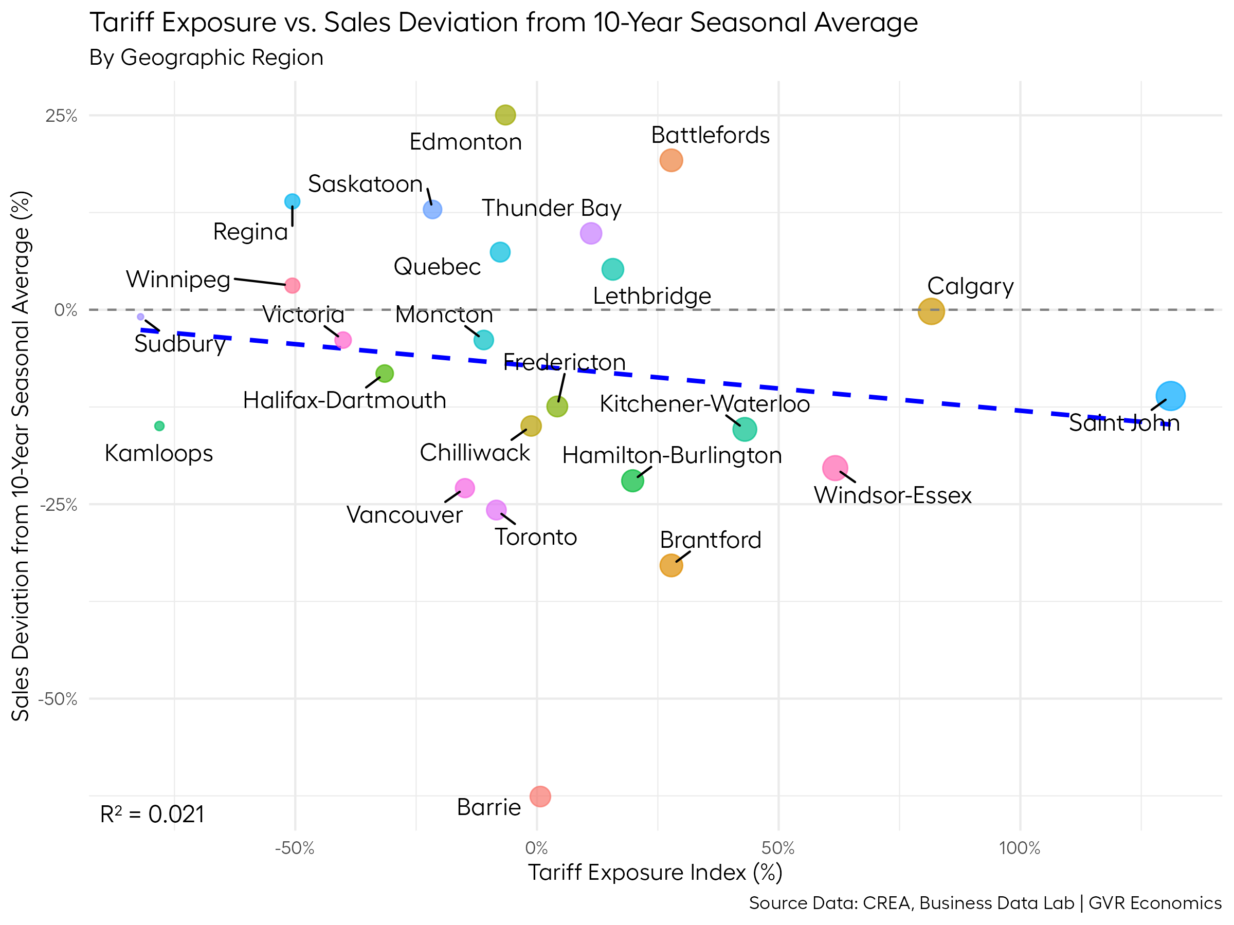
Womp womp.
There’s basically no relationship here (r-squared = 0.021).
This is a similar situation to what we found with the “uncertainty index” way back in the first post that kicked off this goose chase.
So, while it’s not a complete dead end, this plot at least adds to the mounting evidence that the story of “uncertainty arising from the trade war is what’s dragging down sales” has a more than a few holes in it.
Unemployment
But why rely on a modeled measure, such as the the tariff exposure index or uncertainty index, when enough time has passed since Trump’s inauguration that we can use something more concrete, such as the unemployment rate?
If there’s any real effects from the trade war, they should be showing up in the unemployment rate by now, and perhaps the tariff exposure index doesn’t sufficiently capture the real impacts of the trade war on the ground.
Here’s a plot comparing the change in the unemployment rate since Trump’s inauguration to the sales deviation from the 10-year seasonal average:
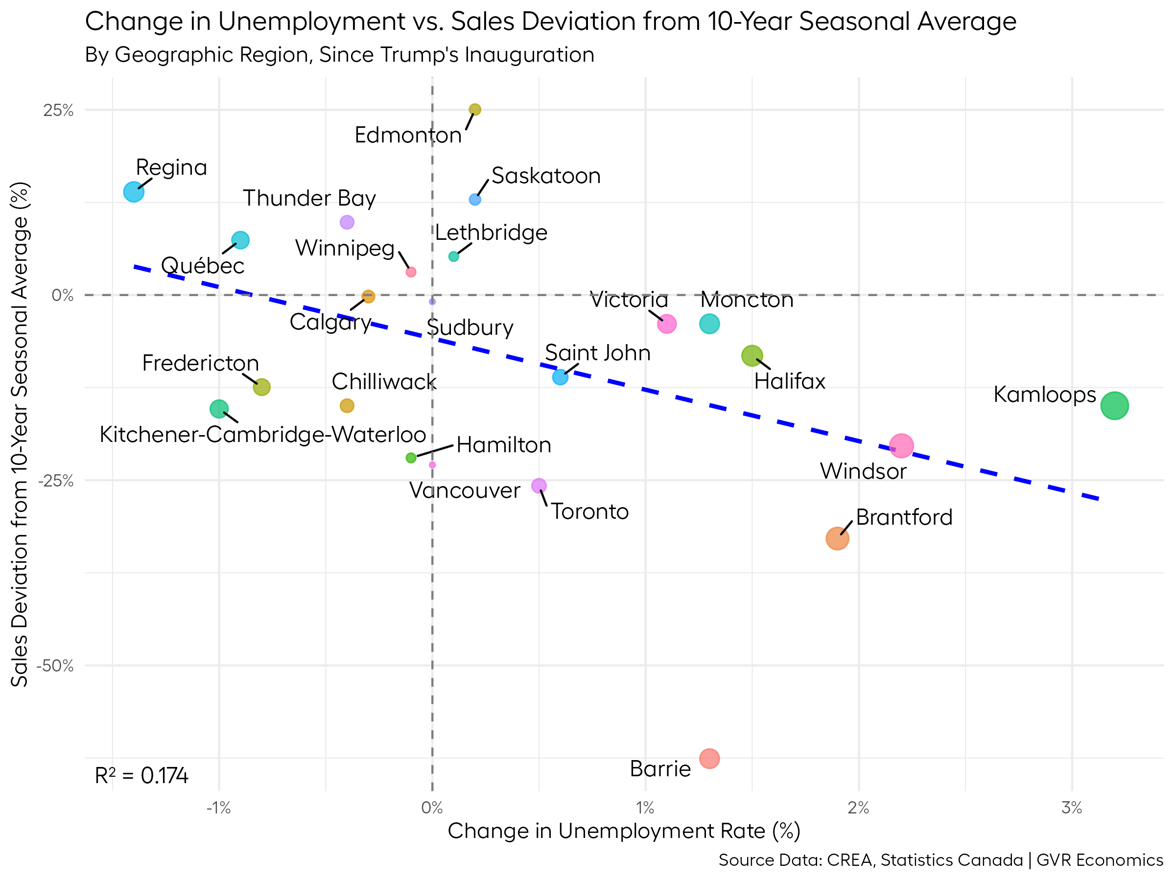
Not a smoking gun by any means.
But, at the very least, we managed to up the r-squared value to 0.174, which is significantly better than the relationship with the tariff exposure index.
And I suppose I can award an additional bonus point due to the intuitive causal interpretation at play here: if you don’t have a job, you’re not very likely to be buying a home.
Most people can wrap their minds around that concept – it’s a tough one to argue against.
But given the relationship here remains fairly weak, this leaves open the possibility that there are other factors at play.
Prices and populations
One issue with the original plot comparing the sales deviation from their 10-year seasonal averages to the price level that’s been eating away at me for a while, is that we know that home prices are positively correlated with population growth.
By virtue of this relationship, places with the highest population growth also tend to be the places with the highest housing prices.
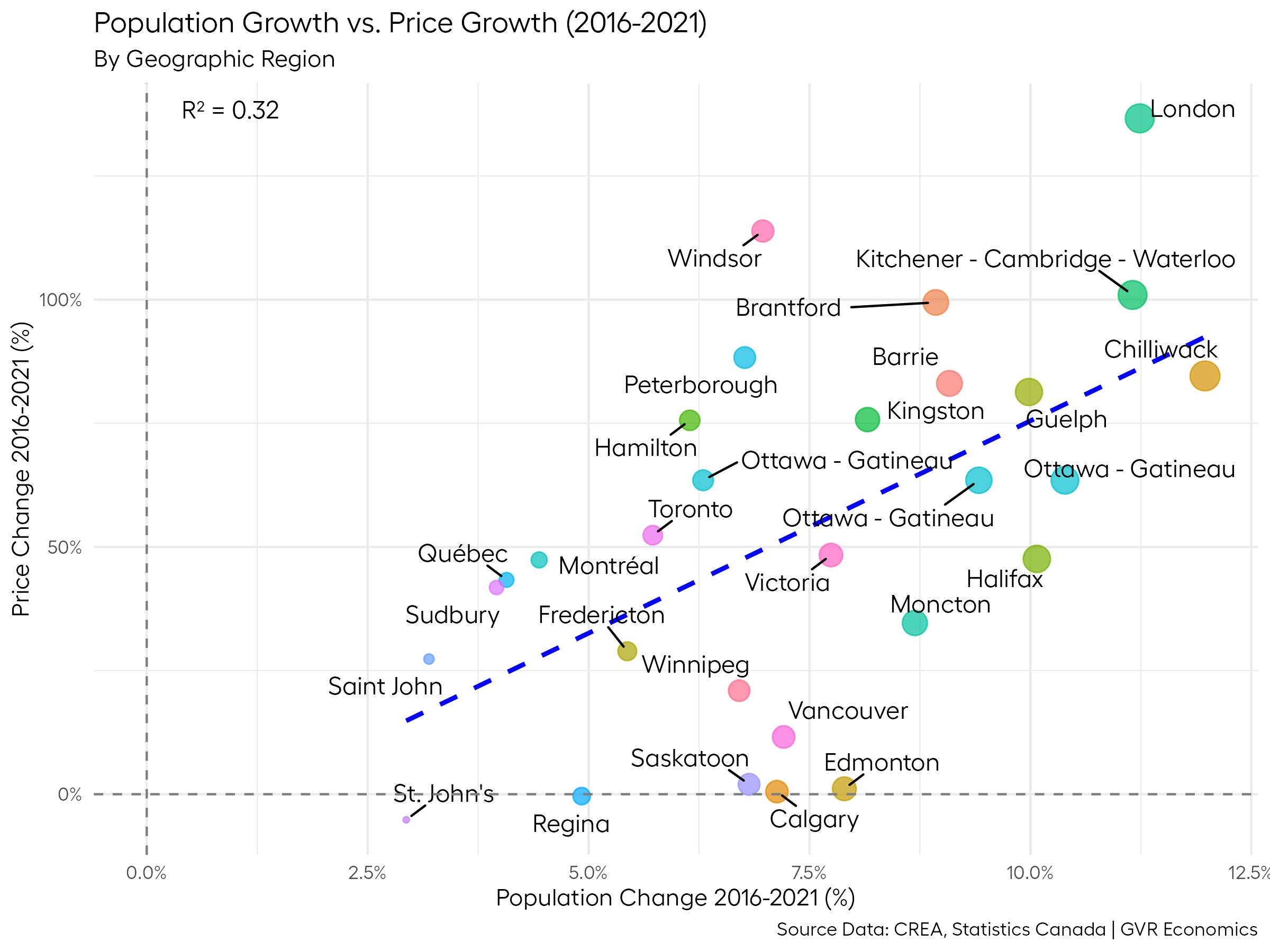
To demonstrate this relationship, here’s a plot comparing the change in population and prices between the 2016 and 2021 census years:
So, while it seems that home prices are integral to solving this puzzle, since these are both correlated, we should be able to swap population growth for prices and get a similar picture to the original plot:
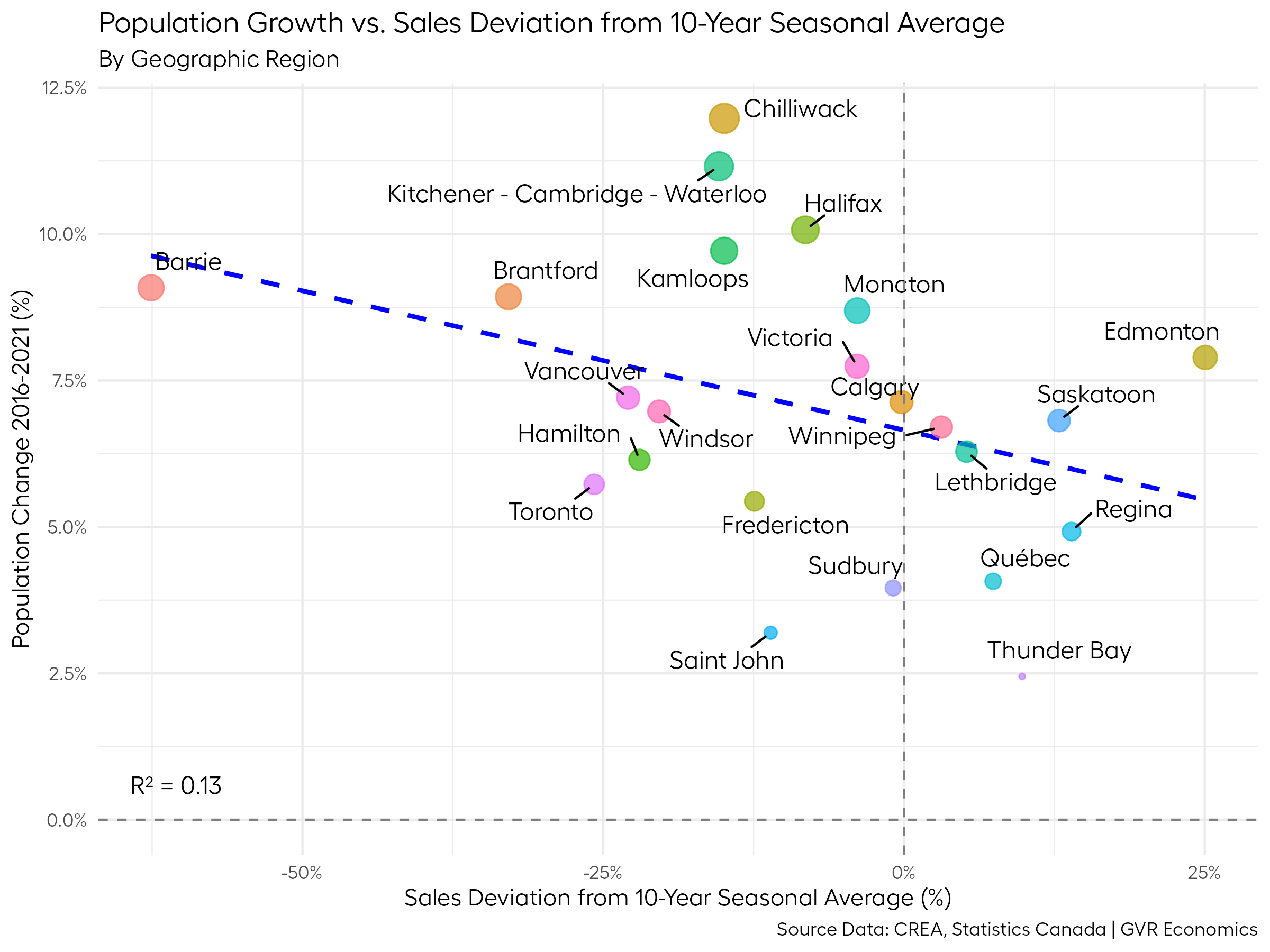
Indeed, that’s (roughly) what we get.
Clearly, this plot is not exactly the same as the one comparing the sales deviation to the price level. With an r-squared value of 0.13, it’s not as strong of a relationship, but it does paint a similar picture.
And while the r-squared value is lower, there is at the very least an intuitive connection between these two variables, since it could be the case that slowing paces of population growth could be what’s slowing down sales.
So, maybe part of the answer (that is also related to the price level) has to do with the pace of population and price growth in recent history?
It feels like we’re getting closer to an answer with this line of reasoning, but the story still isn’t as neat and tidy as it should be.
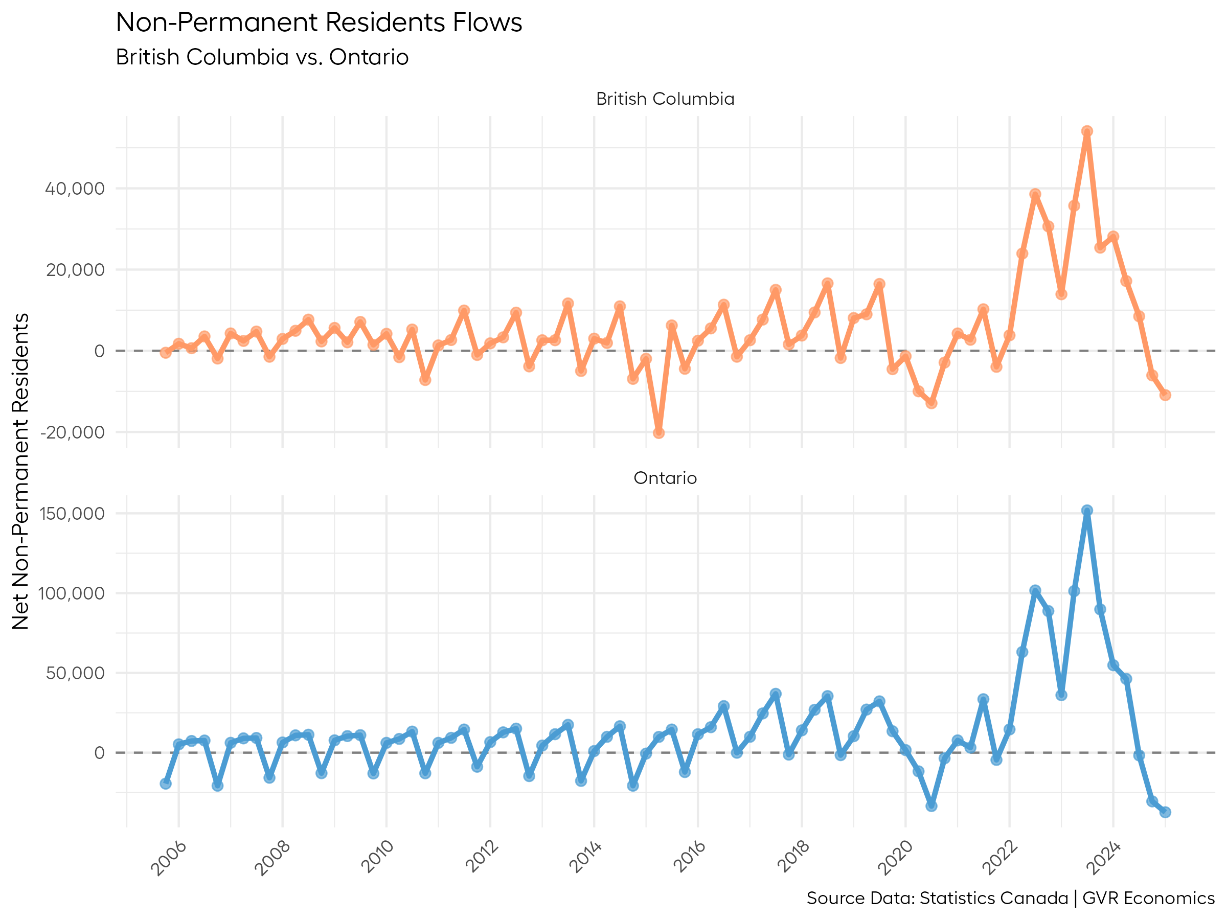
Non-Permanent Residents
On the topic of population growth, there’s been a lot of talk about the role of Non-Permanent Resident (NPR) populations impacting the housing market as of late.
While NPRs don’t typically buy homes, investors do. And NPRs tend to rent homes, so that’s the connection between these two things.
As a result of very high levels of NPRs (as well as immigrants) coming to Canada in recent years, the Federal government decided to walk back immigration levels to try and give the housing market some time to catch up.
For the sake of argument, suppose we think that NPRs play some significant role in impacting the housing market.
If that were the case, one of the first things we’d expect to see out of these recent policy changes is a big slowdown in non-permanent residents coming to Canada.
And if there’s a relationship between NPRs and the resale market, then places that have a high proportion of NPRs should theoretically also be seeing bigger slowdowns in sales.
So, let’s check out that relationship:
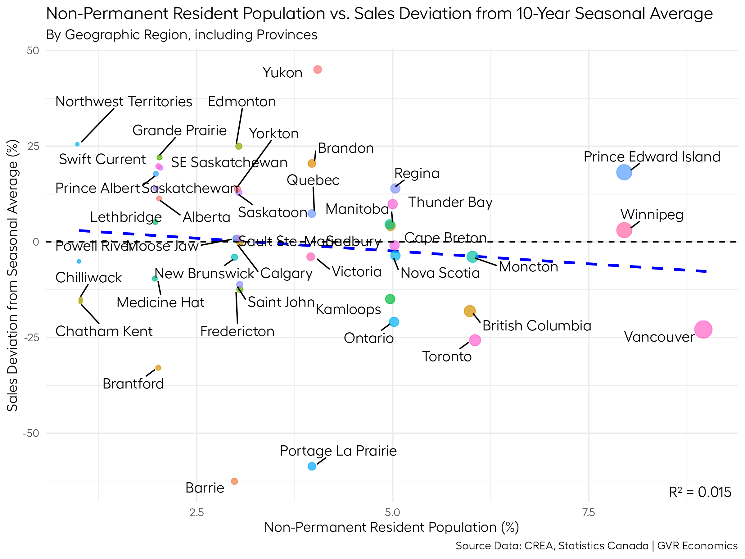
With an r-square value of 0.015, we don’t have much of a relationship here, but again, it’s not a complete dead end.
At the very least, if NPRs do play a role in influencing sales trends in the resale market through the investor channel, these data show that it’s probably not a very big one.
So, maybe the slowdown in sales isn’t being driven by changes to the immigration levels entirely.
But maybe it has something to do with investors, nonetheless?
Investors
Turns out, we can take a look at that.
Here’s a plot of the relationship between the proportion of investor-owned properties in a region and the sales deviation from the 10-year seasonal average:
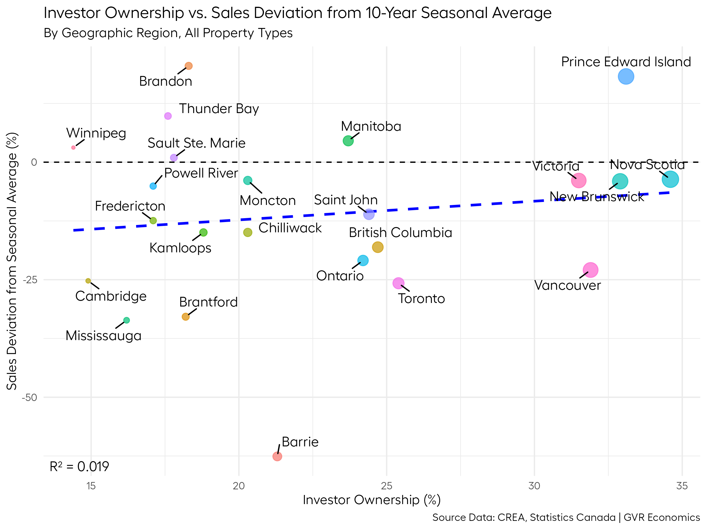
Whoa!
Not at ALL what we’d expect to see here.
Not only is the relationship extremely weak (r-squared = 0.019), but there’s a positive correlation in the data, suggesting that regions with more investor-owned properties are faring better than regions with fewer investor-owned properties.
Not a dead end again, but it adds a bit more fidelity to the story.
We can at least say that the investor story is probably a pretty weak candidate.
Overbuilding
Rounding out the analysis, we’ve been hearing a lot about overbuilding in the Vancouver and Toronto markets.
There is a TON of unsold new home inventory avaiable for sale out there. Maybe the slowdown in sales has to do with people fearing a glut of new homes hitting the market?
Here’s a plot showing cumulative total housing starts over the last 10 years versus sales deviation from the 10-year seasonal average:
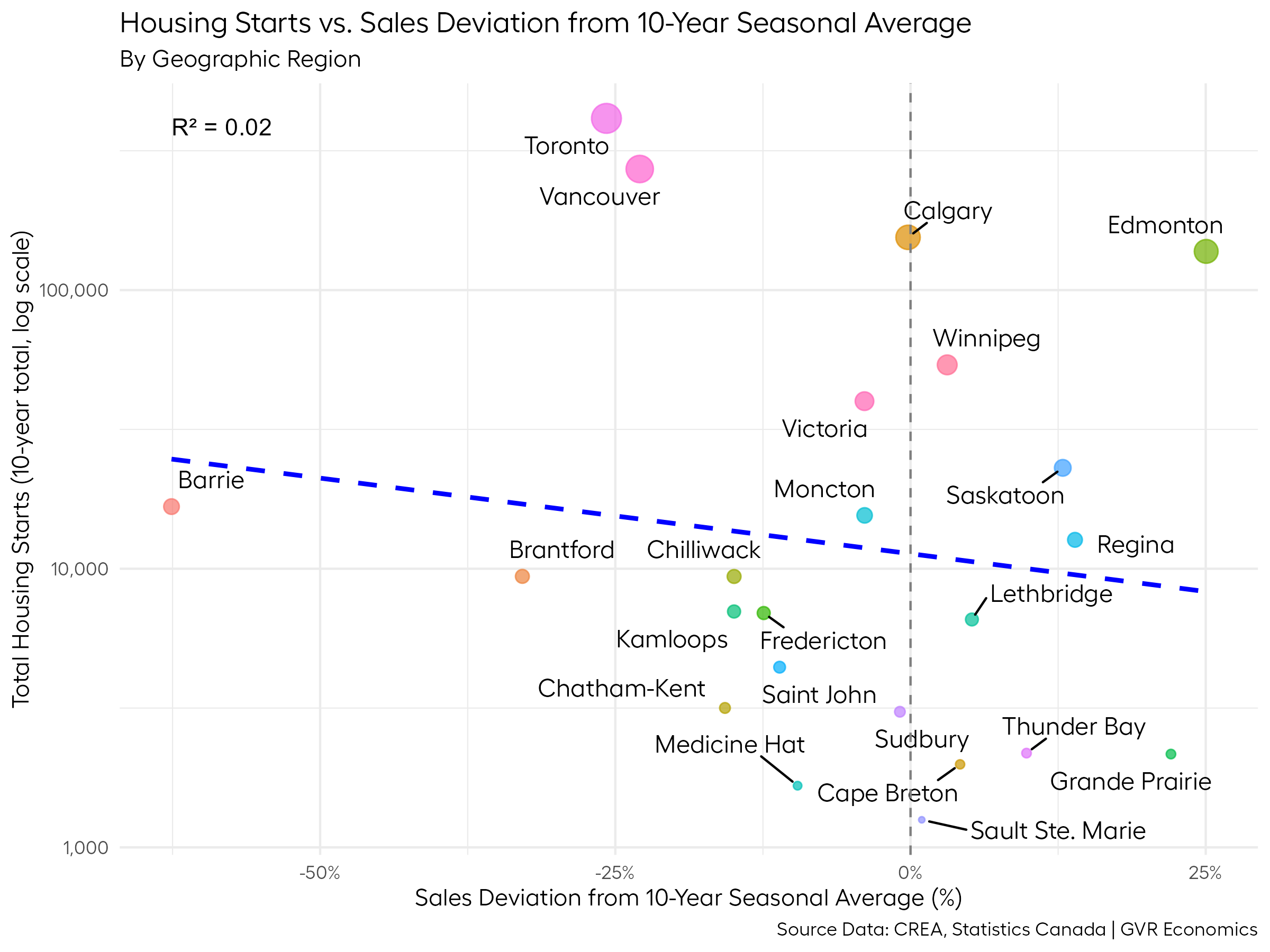
Ok, not much of a relationship there either (r-squared = 0.02).
We could go on and on like this examining every possible factor out there, but we found a thread earlier that’s probably worth pulling further on, so at this point, I think it’s time to turn back to that.
Full circle
Earlier in the post when we were examining the relationship between population growth, prices, and sales, we hit on an insight that maybe the explanation we’re looking for has something to do with growth.
We saw that places that had seen higher population growth also tended to be places with higher prices and slower sales.
So maybe the explanation has more to do with the growth of prices, as opposed to the level of prices themselves?
If you think about what scares people when buying real estate (or almost any big financial asset), it’s the fear of losing money.
No one wants to buy the top.
And looking at the data, it seems like places that saw more dramatic price changes over the last 10 years are also now seeing much bigger slowdowns in sales (relative to their 10-year seasonal averages).
If we can quantify the volatilities of prices in various markets over time, we could use those measures to compare with the sales deviation from the 10-year seasonal average, and maybe we’d get a stronger relationship than we saw by using the price level itself.
Here’s a plot comparing the price volatility over the last 10 years to the deviation of sales from their 10-year seasonal averages:
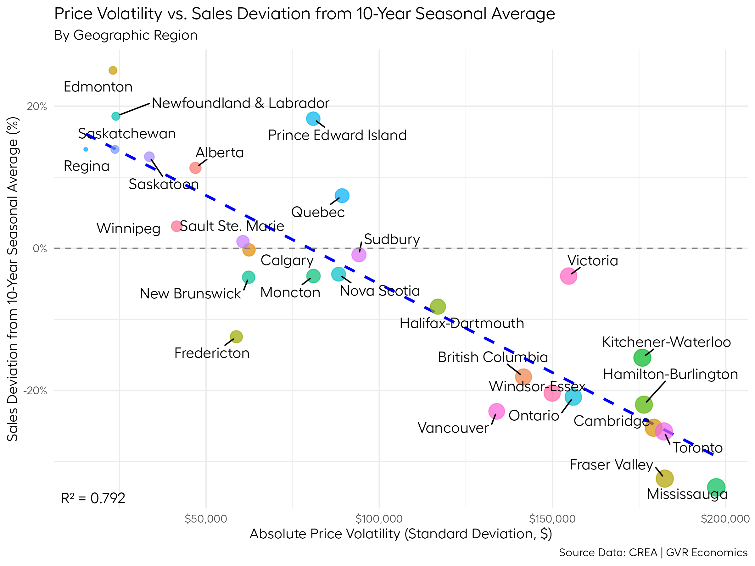
Boom.
R-squared = 0.792!
That’s pretty darn good for data in the wild.
Now, a cautious reminder that this is evidence of a strong correlation and not necessarily causation.
And this feels a bit like cheating, because we just transformed the price level data a bit and got a better result.
So, I have to give credit where it’s due to Brendon for being the first person (I know of) who made the connection between the prices and the slowdown.
And while I didn’t fully subscribe to the interpretation of his original chart that sparked all of this additional analysis, he definitely managed to capture lightning in a bottle with his initial insight.
Kudos to him for that.
It was here all along
This conclusion feels a bit like the twist ending of Planet of the Apes, where the main character realizes he’s been on planet Earth all along, after stumbling across the ruins of the Statue of Liberty.
But I would say that presentation of the data here has a nicer and more sensible interpretation than using the price level.
This presentation helps explain how certain markets could be seeing sales activity picking up in the face of the uncertainty out there, while others are slowing down.
This is a nice feature that was lacking from the interpretation of using the price level versus sales activity.
So, it seems to me that this story has to do more with the fear of prices falling further after purchasing, as opposed to the uncertainty of losing one’s job because of the trade war.
I have no doubt that uncertainty is part of this story in some sense, but it feels like more of a sidebar catalyst than the primary driver.
I know it’s a subtle distinction, and to many, these concepts are close enough to be one and the same.
But from a technical standpoint, in places where the swings in prices are less dramatic and home values tend to climb at a fairly slow and steady pace, it makes sense that buyers would feel more comfortable entering the market even with all the uncertainty going on out there.
It makes sense that these markets could have sales running above their 10-year seasonal averages, especially with all the cuts to interest rates we’ve seen in the recent past.
By contrast, it makes sense that buyers would be more hesitant to enter the market in places where we’ve seen big swings in prices (especially in the last 10 years), or in places where post-Covid, prices continue to appear “too lofty”.
And that’s how we can have markets where sales are running below their 10-year seasonal averages, while other markets are running above.
I still feel like this conclusion isn’t quite as satisfying as I’d like it to be, but it probably won’t matter much in a few months anyway.
The market seems to be picking up a little, so maybe we’ll be back to “normal” sales activity in the very near future and we can put all this uncertainty behind us.