It’s mid-March, and we just got another quarter point rate cut from the Bank of Canada.
Yay! 🎉
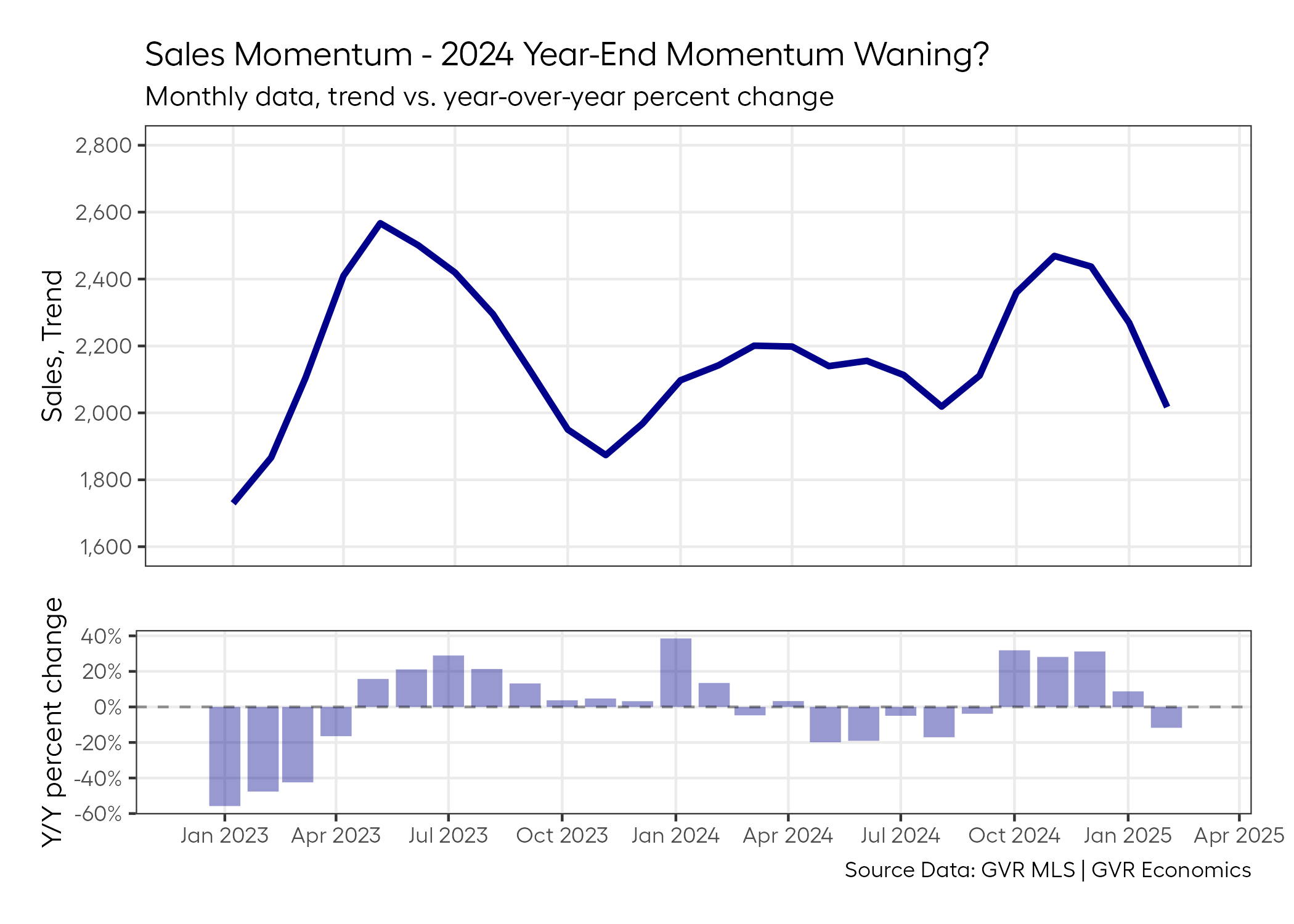
But unfortunately, sales in the GVR market seem to be losing some of the solid momentum they had going into the start of the year:
And it seems that lately, as result of all these shenanigans going on south of the border, any “bad news” – whether that be for the housing market or the economy – is getting blamed on “economic uncertainty”.
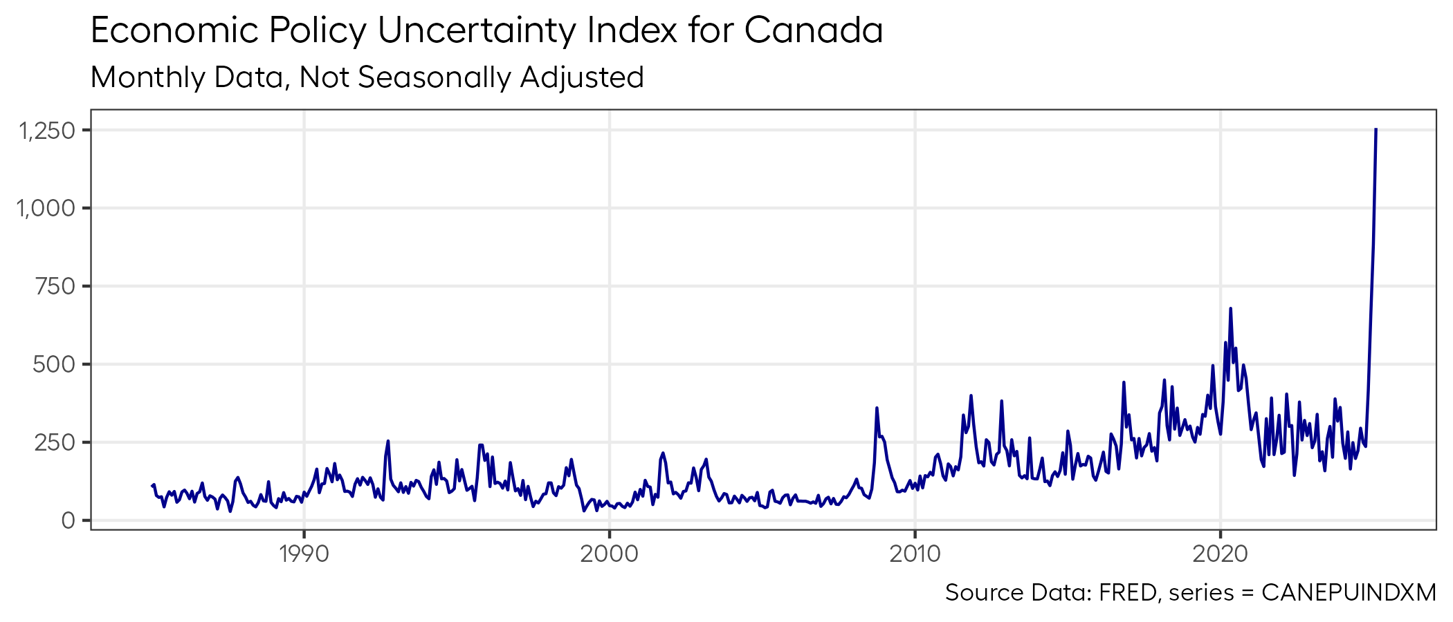
It’s a convenient scapegoat, and depending on the bent of your social media feeds, maybe you’ve seen fearmongering charts like this one in your timelines as of late:
These foolish games
Now, this is the kind of chart I both love and hate for the following reasons:
- I LOVE this chart because it’s so simple and it is absolutely SCREAMING FOR YOUR ATTENTION!!!!!1.
- I HATE this chart becuase it doesn’t tell us whether we should really care about it at all, which in my view, is among the worst possible chart crimes one can commit.
To parse that second statement a bit further, think about it for a second.
What does this chart really say?
All it says is that there appears to be more “economic policy uncertainty” relative to the past, and it appears to quantify this to some degree. But what do these index numbers even mean?
Is a reading of 1,250 actually large? Relative to what? How large is large? Should I think of this index in log-scale? Etc.
Underneath the purported sophistication of an “economic policy uncertainty index”, really just lies some pretty trivial math, beneath which, lies some arbitrary choices about what constitutes “economic policy uncertainty”.
It’s a pretty debatable “metric”, and if you want to learn more about how an index like this comes into being, you can read about the methodology for the one I’m using here.
But for the purposes of this post, we’ll just be evaluating whether this kind of index matters to the housing market at all.
Prove your mettle
The first question that comes to my mind when I see a chart like this is:
“Does this actually correlate with anything I care about?”
I have no doubt that this index is probably useful for identifying historical periods that had a lot of economic or political turmoil.
It’s not entirely clear that one requires an index to do that, but since one exists, sure, why not?
And given that a metric exists, it seems like a pretty natural thing to check whether this index correlates to someting housing analysts like myself care about, like home sales for example.
A matter of technicality
Before answering that question, we need to resolve a few technical matters.
We can’t just run a correlation of this index against homes sales data in their raw form because as I pointed out earlier, the actual numerical level of the index is completely arbitrary and meaningless on its own.
And we know that home sales in their raw form have very obvious seasonality present that we’d need to deal with, so that we aren’t being fooled by entirely predictable repetitive seasonal patterns.
So we need to convert both series to something more meaningful for our analysis.
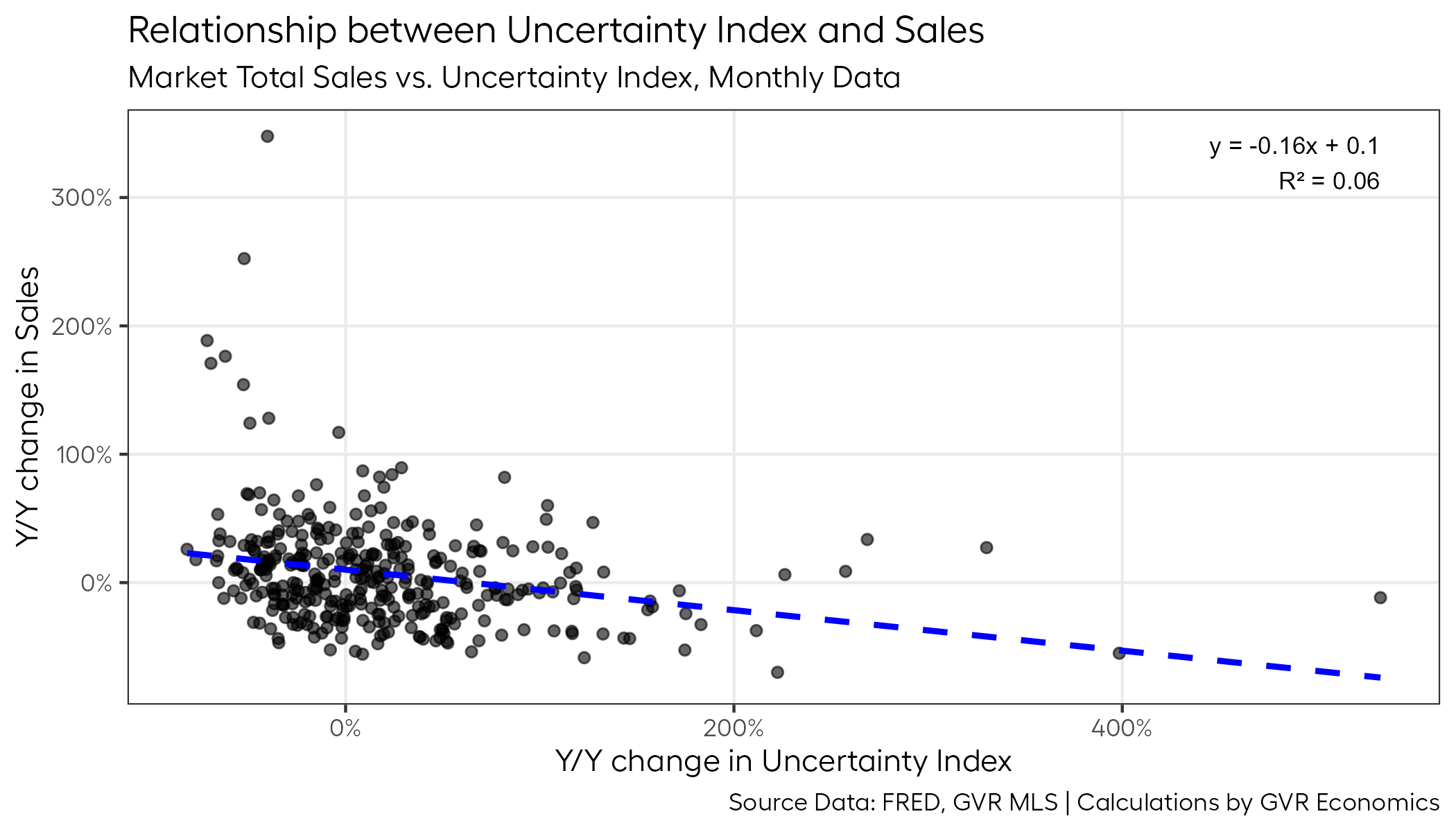
One of the easiest ways to do this is to calculate the year-over-year percentage change for each series, and then compare them in a scatter plot.
This way, we deal with the seasonality of home sales data2, while simulataneously converting the uncertainty index into something that measures the change in the index relative to itself, in some historical period.
And by using a scatterplot, we can visually check whether a strong (or weak) relationship between these data exists.
So, without further ado, here’s a plot of that:
Arrrrgh-squared
If you were hoping to find a smoking-gun relationship, prepare to be disappointed.
One of the first things that jumps out from this plot is that the R-squared value, which tells us roughly how strong the relationship is between these data series, is really low.
Like, really, really, REALLY low.
So low, it’s basically saying there’s almost no relationship between these two data series at all3.
If there were some true value to extract from this “economic policy uncertainty index” as it relates to how “economic policy uncertainty” may impact home sales, it’s not immediately obvious at this point (from a quantitative perspective).
No leverage
Folks familiar with this kind of analysis may note that the plot above has some pretty big leverage points on both the X and Y dimensions that could be messing with our analysis.
For those who read that previous sentence as an alien language, here’s a translation:
There are some dots that are far away from the main group. These outliers might be affecting our analysis by pulling the line of best fit in their direction. Because of this, our R-squared value could be lower than it would be if we removed them.
So, for the sake of ruling this possibility out, let’s chuck out those levering data points out and see how that impacts the analysis.
Here’s a plot of that:

Unlike a certain 47th US president who holds quite a lot of leverage over global affairs at the moment, these few outlier data points don’t seem to be holding as strong of a hand.
The R-squared value actually dropped a bit, which again just reinforces the point that there’s not much predictive value contained in this “economic policy uncertainty index” as it relates to homes sales.
At least from a statistical perspective.
And that’s what you came here for, right?
So, what now?
If we’ve established that “economic policy uncertainty” doesn’t seem to have much predictive value for home sales, then what explains the waning momentum?
What happened to all that gusto the market had heading into 2025?
What changed?
I don’t really have a good explanation for the January data, which was up weakly by about nine per cent over last year.
But February had a pretty decent sized snow storm, and maybe that kept buyers from heading out house hunting?
Maybe that’d be a relationship worth checking?
Here’s a plot of that:
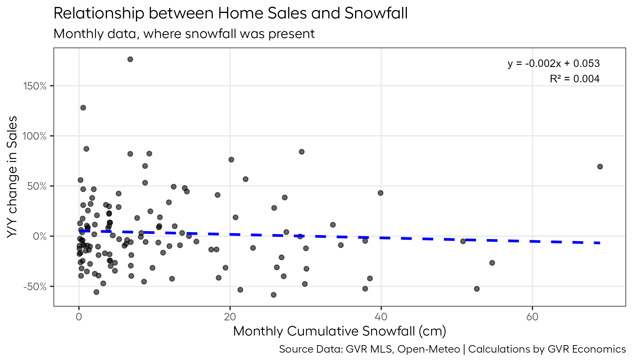
Unfortunately, as much as we British Columbians like to blame things on the weather, there doesn’t seem to be much of a relationship between the amount of snow on the ground and home sales.
So the waning momentum remains a bit of mystery at the moment.
As convenient as it may be to blame the softer demand on “economic uncertainty”, it isn’t very comforting knowing that the data barely supports that narrative, if at all.
And although we weren’t able to find a culprit for the sales slowdown in this post, at the very least, I hope this post helps our dear readers see through all the FUD bubbling up out there at the moment.
For now, we’ll have to wait and see if cooler heads prevail in the political arena in the coming months, and whether buyers come back in a big way this spring as the weather gets better.
Which, after all of this, we now know are probably barely factors at all.
But there’s always hope!
Footnotes
Which is also not-so-coincidentally why you’ve probably seen it (or a variant of it) in your respective social media streams.↩︎
Mostly. There may still be some seasonality present in the data, but the amount should be low enough that it won’t impact our analysis significantly.↩︎
Without getting too technical, genearlly, the R-squared value will range between 0 and 1, with values closer to 1 signalling a very strong relationship between the series.↩︎