In part one of this two-part post, we took a look at the likelihood that the Bank of Canada would continue tightening monetary policy going forward.
In this post, we’ll take a retrospective look and examine the impacts previous tightening cycles have had on the Greater Vancouver market.
Buckle up, it’s a longer post, but worth the read!
A matter of perspective
As industry participants, many of you would probably characterize the impact of the current hiking cycle on the Greater Vancouver market as something akin to “demand destruction”, or maybe something using more colourful language.
Indeed, sales are down by quite a bit relative to 2021 and 2022, but it’s important to keep in mind that the past two years were unusually strong markets. The full picture is perhaps less dire than figures comparing to those specific periods of time might suggest.
Nonetheless, the data clearly show the market has slowed considerably as result of the current tightening cycle, and there is evidence that valuations have also declined by varying degrees across areas and market segments since the peak pricing of 2022.
But how bad are things, really? And can we put the current cycle in perspective by comparing it to earlier tightening cycles our market has gone through?
As it turns out, yes! Yes, we can.
But first, some technical details
To try and analyze this question, we need two key pieces of information.
First, we need to identify every tightening cycle in recent history, and second, we need to know what happened to the market during and after those periods of time.
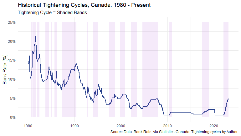
To address the first requirement, I tediously sifted through the historical data and identified every tightening cycle on1 record going back to the early 1980s.
Here’s a plot of that effort, showing each tightening cycle identified as shaded bands in the plot below:
To address the second requirement, I used the timestamps of these historical tightening cycles to pull sales and average price data for Greater Vancouver for the periods 36 months after the start of each cycle, so that we can analyze what happened to the market.
Since sales and prices were at different starting levels at the beginning of each historical tightening cycle, I also had to “index” the data to compare the impacts across cycles on as apples-to-apples2 basis as possible.
As a result, in the analyses that follow, we’ll be examining percentage changes in sales and prices relative to their starting values at the beginning of each tightening cycle.
The seasons, they are a changin’
Since sales data exhibit seasonal patterns, I also needed to make an important analytical choice regarding the specific transformation of the sales data to use, with the choices being: raw data (i.e., no transformation), seasonally adjusted, or trended.
There are pros and cons to each choice, and for the sake of visual clarity in analyzing the trends that occurred during each tightening cycle, I chose trended data3 in lieu of the raw or seasonally adjusted figures.
For the extra-curious, here’s a quick plot of indexed sales for the 1980-1981 hiking cycle to visually demonstrate the differences between the three choices:
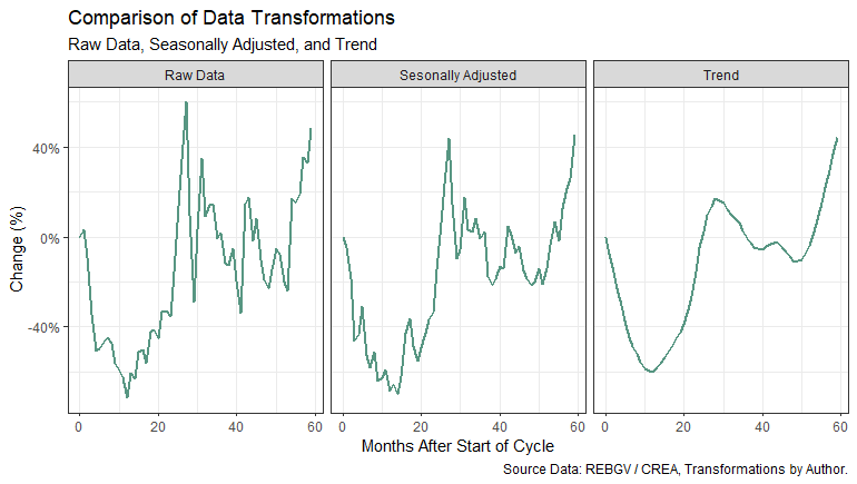
It’s easy to see from the plot how one could repeat the analysis using the raw or seasonally adjusted data and come to highly similar conclusions while having slightly differing numerical results depending on the chosen transformation.
For the sake of full transparency, it’s worth noting the trended data tends to slightly undershoot on both the upside and downside – but it does this across all the trended data, which means comparisons remain consistent relative to one another.
Finally, to keep things tidy and as consistent as possible, I also trended4 the average price data in the following analyses.
The end of the world as we know it?
With these technical details out of the way, we can jump into the analysis.
We’ll start by examining the historical impact tightening cycles have had on home sales in Greater Vancouver.
Here’s a plot showing the historical reaction of sales to each tightening cycle, from the beginning of each cycle to 36 months afterwards:
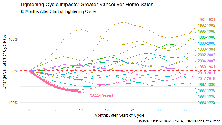
If you’re finding the plot overwhelming with so many lines, you can thank me later for not choosing to use the raw or seasonally adjusted data! Trust me, this plot is *much* easier on the eyeballs, despite the initial perception of complexity.
But don’t worry too much about all the lines for the moment. I’ll walk us through the plot step-by-step, and to start, let’s zoom out and begin by looking at the big picture.
Lessons from the past
The first thing that jumps out is that not every hiking cycle in history resulted in a dramatic decline in sales – in some cases, sales actually increased in the face of some tightening cycles!
So, the first lesson here is that tightening cycles haven’t *always* translated into the end of the world for home sales in our market, historically speaking.
The second lesson is that in most cases, 36 months after the beginning of the tightening cycle began, sales had (mostly) recovered to levels seen at the start of the tightening cycle. And in more than a few cases, dramatically exceeded the level of sales when the tightening cycle began!
All right, so that’s all pretty interesting, but we’re not done with the story of sales quite yet.
The struggle is real
The next thing that stands out in the plot is that at a little under one year into the current tightening cycle, the impact on sales is one of the worst on record – in fact, it’s *the* worst on record5.
It’s important to remember that 2021 and early 2022 were some of the strongest periods in our market on record, so coming off the heels of such strong markets is likely to paint a somewhat overly pessimistic picture. And it’s probably worth pointing out that sales were slowing before the tightening cycle began anyway.
But there isn’t much sense trying to sugar coat it. The data clearly show that the current impact on sales has been quite significant relative to other historical tightening cycles.
How about the future? What historical path might the current cycle most closely resemble?
Objects in the rear-view mirror
Perhaps the closest analog we have for the current path of sales is the 1980-1981 tightening cycle, which had sales back at pre-cycle levels in a little over 24 months (on a trended basis).
I’ve highlighted the 1980-1981 cycle and the current cycle in the plot below to make the comparison a bit easier to visualize:
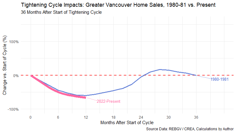
So far, it looks like the present trend in sales might continue following a similar path, but anything can happen! And as bad as the early 1980s was for real estate in our market, there are some pretty notable differences between then and now.
To name just a few examples, today we have much lower interest rates, much higher home valuations, and a chronic scarcity of housing. And, of course, the elephant in the room: the lingering effects of the COVID-19 pandemic, in all its various manifestations (e.g., high inflation, labour shortages, etc.).
So, while there may be similarities in the today’s path of sales to the 1980s, the speed at which things could turn around today is amplified by these various factors (among others). So far however, the recovery looks on track to be fairly slow and stable, approximately mirroring the 1980-1981 cycle.
Pricing pandemonium
Because home valuations in Greater Vancouver are among the highest in Canada, any sudden changes to valuations in our market tend to attract a lot of attention.
But it may not come as a total surprise to learn that just like the historical impacts on sales, the impacts on valuations haven’t always been negative either, despite the natural human tendency to imagine the worst-case scenarios.
Have a look at the following plot tracking the change in the average home price from the start of each tightening cycle to 36 months later:

If I’m being perfectly honest, I had expected to see a much less rosy picture of these data when I first ran this bit of analysis on prices, especially since we are coming off such a prolonged period of record-low interest rates.
But when we start filling in the picture with other bits of information we know today (but couldn’t have known while living through these historic cycles), the patterns in the data start to make more sense.
I’ll come back and elaborate on this point at the end of this post.
But before I do, let’s dig into the price data bit further by zooming out to look at the big picture.
How bad is it, doc?
The first thing we notice is that, just like with sales, the impact of every tightening cycle in history did not yield price declines in every scenario.
Prices actually rose in the face of more than a few tightening cycles. And in almost all cases except the 1981 and 1982 tightening cycles, prices had fully recovered to, or even exceeded, pre-cycle levels 36 months later.
And as we know all-too-well today, home valuations have come up a *lot* since the 1980s, with the long term upward mega-trend remaining extremely difficult to break.
As an aside, it’s worth taking a moment to note that this plot does a nice job of visually depicting why the early 1980s remains a period of infamy among experienced6 brokers and agents who lived through that particularly challenging cycle.
Younger folks can perhaps have a greater appreciation for the stories of their older counterparts when looking at a plot like this one. The 1980s were indeed quite brutal to our market – both in terms of the impacts on sales and prices.
The bright side of the story is that the picture today, while not exactly rosy in many respects, remains pretty far-off from the absolute worst of the 1980s (so far).
Pricing the future
What can we say about the most likely path for home prices in our market?
Again, we can turn to searching for analogs in the chart, and we might point to something like the 1982 cycle (highlighted in the chart below):
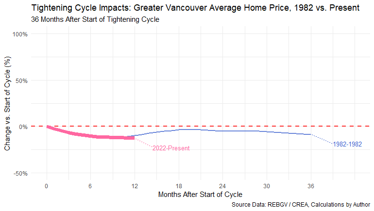
Up to this point, the current trend is tracking the price trend of the 1982 cycle quite closely.
Theoretically, if this pattern were to continue, pricing in the Greater Vancouver market would increase to levels observed near the peak pricing of 2022 in roughly six months from where we are now.
But that’s just a hypothetical scenario based on nothing more than a historical analog, and we can do better than that!
For some well-considered estimates of where our market might be at by the end of 2023, take a look at our 2023 residential market forecast.
Gravity and gravitas
In closing, I want to come back to a point I made earlier about filling in the picture with other bits of information we know today that we didn’t know in earlier cycles. I think it might offer more fruitful guidance on the future of our market.
It’s not uncommon to hear people talk about the potential for an extremely large correction (a.k.a. “crash”) in the Greater Vancouver market – usually, the argument is a variation of a “what goes up must come down”, kind of nature.
And if there were ever times for such an event to materialize, the past few years have certainly made for exceptional candidates.
So why hasn’t gravity brought the apocalypse to our market (yet)?
To start, the “gravity logic” tends to overlook a lot of factors impacting our market today that we didn’t have a great understanding of historically. This was largely because we didn’t have the data, technology, and free exchange of information to understand these factors as we do today.
And in my view, the serious issues before us impacting the future of housing and affordability in our market are some 40+ years in the making. They’re the culmination of numerous complex and ever-evolving societal and economic factors.
A combination of demographic trends, political dysfunction (as it relates to housing specifically), and macroeconomic trends have all converged in this moment in time to create the housing market we see before us.
And that market is one characterized by a far greater demand for housing than there is ability (and political willingness) to deliver the needed supply. Under these circumstances, the long-term prospects for valuations and home sales in our market remain very strong – though not entirely unshakeable.
As I’ve said many times: anything can happen. And we should always expect to have a few wobbles along the way.
The current cycle is no exception.
Footnotes
In this post, I am simplistically defining a tightening cycle as a series of sustained upward movements in the bank rate.↩︎
The BoC adopted the current monetary policy framework in 1994, which means previous policy rate hiking decisions were guided by a slightly different set of principles than they are today – so not every hiking cycle is truly an apples-to-apples comparison, at least from a monetary policy perspective.↩︎
I could provide a really long-winded explanation as to precisely why this is (probably) the best choice for this exercise, but what it ultimately comes down to is that it helps make the charts more visually digestible and the discussion much easier to follow.↩︎
The impact of this transformation is much less noticeable than on the sales data since price data do not typically exhibit (significant) seasonal patterns. Because of this, the effect of this transformation is largely negligible – it mostly just makes the charts easier to read by smoothing out the series.↩︎
Based on the trended transformation of the data.↩︎
A polite term for individuals born pre-1960(ish).↩︎