What makes a trend? Do two data points in time make a trend? What about 100 data points? Or 10,000? When is something a trend, and when is it considered statistical noise?
Believe it or not, this isn’t a simple question to answer.
To attempt an answer, we need to narrow the scope, and in this post, we’ll do that by paring the discussion down to analyzing our favorite topic: the housing market.
Data, over time
Transactional data on the housing market is typically reported and discussed in monthly, quarterly, or annual time-frame aggregations.
There are more than a few reasons for these choices, but a key factor is that there aren’t usually enough 1 transactions in a day (or an hour, or a second) to calculate a meaningful statistic, such as an average price. In addition, housing markets move much slower than something like a stock market, where having access to tick-by-tick data has become the norm among traders and financial institutions.
As a result, these time-frame aggregations have become the de-facto standards most often referenced by people who analyze and comment on housing market data.
When does a trend emerge?
Housing market trends tend to emerge from the data when we look at these monthly, quarterly, or annual timeframe aggregations. Within these aggregations, clear repeating patterns emerge in some series (e.g., monthly sales), which occur for reasons relating to seasonality – that is, the tendency for a number to be higher or lower regularly based on the time of year. And in other series (e.g., average or median prices), the number in any given month can fluctuate randomly, which can lead one to think there is no clear trend, or that the trend is just statistical noise.
Complicating things further, transactional housing market data is often reported to the public in month-over-month, or year-over-year percentage change figures. These measures, while useful in certain contexts, are derived from only two data points in time, and where misunderstandings often arise is when long-term “trends” are inferred from these simplistic short-run calculations.
It’s pretty easy to find evidence of this confusion by looking at the plethora of media stories reporting on “housing bubbles” that cite a singularly large year-over-year price change, or a cherry-picked month-over-month sales decline as the supporting evidence. In many cases, these fluctuations are, in fact, nothing more than regular and totally expected seasonal patterns – they really aren’t “trends” in the most meaningful sense of the term.
Short-term vs. long-term dynamics
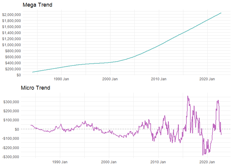
And if things weren’t confusing enough, it gets even more complicated when we try to understand short-term and long-term dynamics in greater detail. Consider the plot below for example.

Both panels depict trends in monthly data spanning roughly 30 years, but one displays much more volatility than the other. From a cursory glance, it wouldn’t be unreasonable to suggest that the trend in the lower panel (the micro-trend) is actually pretty flat over the entire period (if we had to draw a straight line through it).
Sure, there are many ups and downs, but overall, the value of the series in the end isn’t really that much different than the value at the start. By contrast, the upper panel (the mega-trend) has an obvious long-term upward trend, and the ending value is quite dramatically different than the starting value.
While it might appear as though the data in the above plot come from two different planets, these data actually come from the exact same data series.
It’s true!
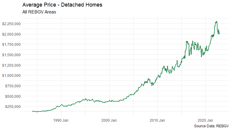
These charts are both derived from the average detached home price series for the REBGV market area dating back to the 1980s. Here’s a plot of the original data:

To reveal the magic behind this visual illusion, it’s helpful to start by understanding that the data in all the above plots are called “time-series” data, which are pretty much what they sound like – data that spans time.
Trends vs. cycles
An interesting feature of (nearly all) time-series data, is that they can be decomposed into what are called “trend” and “cyclical” components. Essentially, this statistical decomposition technique extracts a smoothed trend from the data, with the leftover data from the extraction process comprising the cyclical component(s).
These cyclical components oscillate around the smoothed trend and can have regular oscillations at repetitive and predictable intervals (i.e., seasonal data), or, they can have oscillations of varying lengths that don’t have predictable regularity to them at all. And this decomposition method can be applied to (almost) any time-series data, as long as there’s enough data to extract the various components.
But this technical and verbose explanation probably isn’t doing this conversation a lot of justice, and since a picture is worth a thousand words, it might be best to try and illustrate this concept using a visual example.
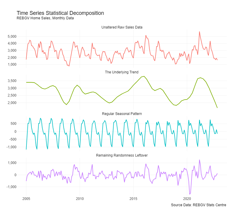
To do so, have a look at the following plot showing the decomposition of monthly REBGV home sales data into its various components:

Yes, there’s a lot going on in that plot! But don’t worry, there’s no final exam on it and there’s no need to get lost in the complexity and technical weeds (unless you want to).
Setting aside the complexity, what’s really most important to understand about the methodology behind the decomposition is that the trend component demonstrates clear and stable directional patterns, whereas the cyclical component(s) are usually noisy and seemingly random or are obvious repeating seasonal patterns. Sometimes they’re a bit of both.
Said more simply: trends are smooth, cycles (usually) aren’t.
Linking this back to analyzing the housing market, it’s pretty easy to find media stories that mistake and/or mischaracterize cyclical variations as meaningful patterns or trends, citing the month-over-month or year-over-year percentage change calculations as evidence.
The long-term trend is indeed buried somewhere in there too, but it’s usually being masked by variation in the data that is either verging on statistical noise or is an entirely expected regularly repeating pattern in the data (i.e., seasonality).
Cutting through the noise
So, what’s the big point here? Is this all just unnecessary complexity and fuss over semantics?
The big point is that what usually matters to most buyers and sellers in the market are the long-term trends, and less-so the short-run cyclical variations – but so often, it’s the short-run cyclical variations that get all the media attention!
And that’s because these mega-trends are typically driven by slow-moving structural factors that are much harder to change overnight, or that simply do not change quickly for reasons relating to Mother Nature (i.e., the length of time it takes to conceive a child, or the implications of technological change on an economy/society, etc.).
These long-term “mega-trends” may be slow-moving, but we shouldn’t underestimate their importance in determining the long-term trajectory of the housing market.
Things like population growth, demographic change, and other slow-moving but hugely impactful factors typically underpin what we see driving long-term trends in housing market data. And it can be easy to miss their (enormous) impact if we focus too much on the cyclical variations, as is so often the case.
By contrast, short-run cyclical factors are typically driven by things like changes to mortgage rates, economic recessions, or adjustments to government policy. And while these factors tend to grab our attention because they’re easy to identify and usually immediately apparent, it’s important that we don’t lose sight of the longer-term picture, or worse, mistake short-run cyclical variations for a long-term trend.
Staying on-trend
As an industry, we spend a lot of time talking about the short-run cyclical variations – it’s human nature to want to understand what’s happening around us in the moment. And the takeaway from this article isn’t that these discussions and analyses of short-run dynamics aren’t important to track – they absolutely are! But it’s also important to keep in mind that short-run dynamics don’t last forever – they can turn around very quickly.
So, if we’re trying to make sense of housing market data and the question is: “Where will our housing market be 10 years from now?”, it would be difficult to forecast based on short-run cyclical factors alone. Analyzing long-run trends will typically yield a more fruitful answer.
Similarly, if the question is: “Where will the market be next month?”, it would be difficult to answer by relying on long-term trends alone, since they don’t move around enough over short periods to give us much guidance. And oftentimes, even the combination of long-term and short-run dynamics won’t provide the kind of clarity one might hope for when trying to divine the future in the housing market – the world is a complex place!
In the end, what matters when it comes to keeping the trends straight in our minds, is that the timeframe contained in the question we want to analyze is consistent with the timeframe of the data used to answer the question.
Footnotes
What constitutes “enough” is in many cases arbitrary, but as a general heuristic, there needs to be a sufficiently large sample size so that singular data points don’t exert enormous leverage in a calculation (for example, a single data point dramatically altering an average price calculation, or a singular data point causing month-over-month or year-over-year calculations to swing wildly, etc.).↩︎