How do we actually know what property values are doing at any given point in time?
If you think about it for a second, it’s a tricky question to answer.
To start, every property in the market isn’t trading hands on a microsecond basis like the stock market, and the long timelines between sales of the same property introduces uncertainty regarding how prices are evolving over time.
Second, we also need to think about what we’re even trying to measure the value of in the first place.
Not all homes/properties are created equal, nor do they share identical features. And there are actually many property types available in the world in which people can live in or purchase for other uses.
Here’s a brief non-exhaustive list, to give one a sense of the multitude of possibilities:
- Detached homes
- Townhomes
- Condominiums
- Mobile homes
- Leasehold properties
- Float homes
- Rental properties
- Vacant land
- Etc.
It’s easy to see right away that the question of what specifically we’re trying to measure is not only critically important to answering the question, but it also introduces complications when it comes to trying to measure valuations accurately over time.
What can you trust?
It’s interesting that there’s sometimes a sense of mistrust and skepticism with regard to the accuracy/validity of various price metrics. If you follow real estate as a topic of discussion for long enough, you’ll probably come across people saying things like:
“The MLS® HPI is untrustworthy because it’s cooked up by the real estate industry” or,
“The average price is the truest indicator of price” or,
“Median prices are the best price measures because they aren’t skewed by outliers” or,
“Repeat sales indexes are the only true measures of price since they track the change in the value of the exact same property over time”.
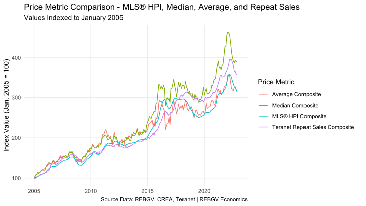
In this post, I’m going to peel back the curtains surrounding the mystery of price measures, so that you can be the judge of which price measure you prefer for yourself, armed with a sound understanding of the pros and cons of each.
Fake it ’till you make it
Let me start out by first addressing one of the more pernicious critiques, which is usually aimed at modeled1 price indicators such as the MLS® HPI.
For whatever reason, there’s a particularly deep-seated skepticism when it comes to price measures created by the real estate industry - even among some industry practitioners!
Typically, the critiques follow a similar line of thinking, which are usually something like:
“Since the MLS® HPI doesn’t perfectly track the raw average or median price, it’s therefore the case that the real estate industry is faking the data to try and pump up the market”.
And while everyone loves a good conspiracy theory (including yours truly), I regret to inform you that this is simply not the case.
At the root of the issue is the fact that measures such as the MLS® HPI are “modeled” prices – that is to say, they’re price measures derived from a mathematical model that takes large quantities of raw sale price data as an input, and they output a neat and tidy price measure, based on some set of defined parameters.
That’s really all there is to it.
No smoke and mirrors. No magic. No maniacal real-estate industry puppeteer hiding behind the curtains. It’s all just (pretty basic) math under the hood.
Ironically, in the case of the MLS® HPI, the entire methodology for the HPI is publicly available for anyone who might want to read it, so the deep-seated skepticism of this particular price measure is all the more puzzling.
But, that’s not to say that critiques regarding the accuracy or the methodology behind the construction of these kinds of price metrics aren’t valid – there’s always room for debate.
As you’ll soon see: no price measure is perfect.
Raw truth
In contrast to modeled price measures such as the MLS® HPI, “raw” metrics such as the average or median price are sometimes held up as more “trustworthy” alternatives.
But, as soon as one realizes that calculating an average or a median is a mathematical model (it’s just a really simple one), it becomes harder to tell which one is truly “better”.
Why should one trust a simple model such as an average or median, anymore than a more complex hedonic2 model, such as the MLS® HPI? Is there more “truth” to be found in simplicity? Or is complexity a necessary condition of “truth”?
It’s really not that simple to answer without a more well-defined question.
What do you want to know?
If I had to hazard a guess, the primary motivation of most people who turn to price metrics such as averages, medians, or HPIs for guidance is that they wish to use that information to determine the value of their own property, or one they might wish to purchase (or sell, or rent).
But this calculation really isn’t as easy and straightforward as one might think.
For example, suppose one was looking to purchase a one-bedroom condo in downtown Vancouver. Which price measure is most relevant to them?
Should they look at the MLS® HPI for a one-bedroom unit in downtown Vancouver to determine if the particular property they are interested in purchasing is over/under-valued?
And if the list price of the property deviates significantly from this benchmark price, should they walk away from the deal? Or accuse the sellers’ agent of attempting to game the market?
Why should anyone believe that every one-bedroom apartment in downtown Vancouver should be the exact same price? Or more specifically, the price represented by some arbitrary price metric?
If this were the case, those with penthouse one-bedroom units overlooking the beautiful ocean and mountains would be making out like bandits compared to the unfortunate ground-dwellers, looking on to a busy street, lined with overflowing garbage bins.
As I pointed out at the beginning, every property is different, and assuming they’re all the same is a big mistake when it comes to understanding the usefulness of any aggregate price metric.
So, what use are price metrics if they can’t tell us precisely what the value of any specific property is at any point in time?
Skate with your head up
In trying to answer that question, consider what the world might look like if we had no way to track price trends in the housing market at all?
How would a homeowner know how to position the list price of a property they’ve lived in for twenty-plus years and want to sell? How would governments craft policy to try and improve affordability?
Enter: the value of tracking prices over time in a consistent, repeatable, and transparent manner.
By creating a price measure that’s consistently measured over time, we can better understand the dynamics occurring in the market more broadly, even if the price itself may not apply precisely or directly to some individual property of interest.
This can help people to make more informed decisions about moves they may wish to make in the market, and can help them avoid being caught in a difficult position in rapidly shifting markets.
It can also help governments and other policymakers to understand the effects (if any) their policies are having on the market.
And the trick, if there is one to all of this, is that it doesn’t really matter that much how something is measured, as long as what is being measured and how it is being measured is as consistent3 as possible over time, allowing us to compare changes from one period to the next.
As long as that’s the case, the stories almost any price measure can tell us will usually be (nearly) the same, though as we’ll see next, they’re not always facsimiles.
Rhyme and reason
Another common critique of some price measures is that some lag, while others lead – that is to say, some indicators are believed to be more timely indicators of “turning points” in the market.
But is there any truth to that statement?
Here’s a plot comparing various price measures converted to year-over-year per cent changes with significant “turning points” marked. This gives us an easy, at-a-glance way to check if one measure turns sooner than the others.
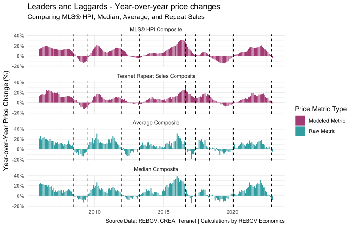
Sure enough, there’s evidence of some indicators leading (e.g., average and median), whereas others lag slightly (e.g., MLS® HPI and Teranet).
But it’s important to note these lead-lag relationships aren’t cast in stone. They shift around a bit – sometimes aligning almost perfectly, while other times showing clear deviations from one another.
And the explanation for why these metrics do this has a lot to do with the constantly shifting nature of what is being measured over time, particularly in the case of the raw metrics such as the average and median.
It’s also worth pointing out that just because one metric leads another doesn’t immediately mean that metric is “more right”.
It’s more tricky than that!
Turn up the vol
Another key point to recognize is that some indicators provide a much less noisy signal of prices (i.e., the numbers don’t jump up and down as much every month), which may or may not be a desirable property of the price measure, depending on the circumstances.
To illustrate, here’s the same plot shown above, but converted to month-over-month price changes, as opposed to year-over-year changes.
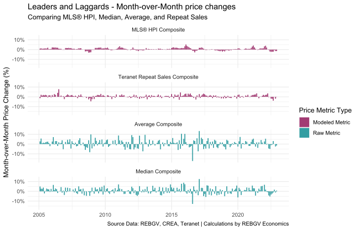
We can see right away that while the raw average or median price metrics might appear more “timely” in the year-over-year charts, the seeming randomness with which they move month-over-month can leave a person guessing which way the wind is blowing.
In addition, we can see that the raw average and median price calculations are far more volatile, suggesting prices are changing much more dramatically than they may be in reality. The cause of this volatility relates to compositional shifts4 in the data, which is too long of a topic to fully get into here – that’ll be an entirely separate post/video for another day.
But very briefly, the composition of sales in any given month can have large and important effects on price metrics, particularly “raw” metrics, which aren’t able to “control” for this constantly shifting composition.
This is what people are (usually) referring to, when they talk about “outliers skewing the price metric” upwards or downwards.
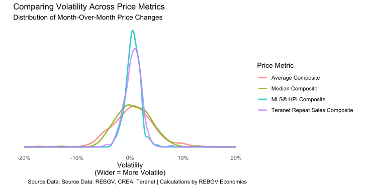
In most cases, having less volatility in the price measure is a desirable feature, since it allows us to track the trend more easily and not get fooled by randomness.
But in some (rare) cases5, the information contained in the noise of more volatile price measure might actually tell us something interesting about changes occurring in the market, provided we have a sophisticated methodology for extracting this information from the noise.
There can(not) be only one
So, which metric is the best metric?
Unfortunately, there isn’t really one metric that’s objectively better across all dimensions – it’s a matter of trade-offs.
As we’ve seen, the primary trade-off we need to consider is the level of signal to the level of noise in the metric. But we should also consider secondary and tertiary trade-offs, such as the timeliness of the metric and its ability to control for shifting compositional factors.
There’s quite a few factors at play to balance!
So, to try and simplify this analysis a little bit, I’ll just focus on the primary trade-off of the signal to the level of noise here.
Price metric shootout
One way to think about the signal present in these metrics, is to consider how smoothly changes occur in the data. If the changes are pretty random and jumpy, it means that it can be hard to isolate the trend.
And one way we can measure “smoothness” is to consider how correlated each value in some time-series data are, as compared to the previous value6.
By measuring this kind of self-similarity, it tells us something about how “randomly” a series moves around (or doesn’t). A higher degree of self-similarity implies a higher degree of “smoothness”, in this case.
But we also need something to measure this signal against.
A natural option would be to use the volatility of the price series because it gives us a measure of just how “jumpy” some series really is. Fortunately, that’s actually quite easy to obtain in this case, since we can just use the standard deviation to give us an idea of the degree of volatility present in each series.
Here, a larger standard deviation implies a higher degree of volatility.
So, now that we’ve got the ingredients, we can just sandwich these two metrics together to obtain a signal-to-noise ratio (SNR).
In geek-speak, the SNR we’re using here is the autocorrelation of each metric at a lag of one, divided by the standard deviation of each metric, respectively.
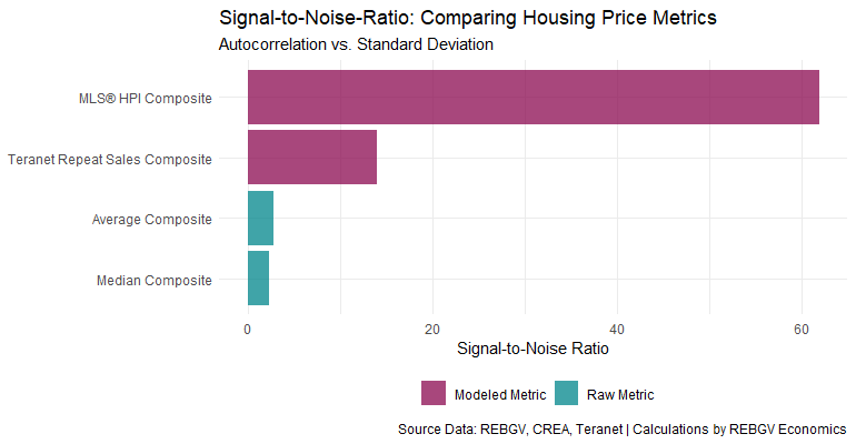
When we compare the price metrics across this dimension, we can see that the MLS® HPI is the clear winner in terms of being able to see the signal from the noise. But as mentioned above, this isn’t the only consideration we might consider relevant.
Nonetheless, this comparison does shed some light on why so many in the industry prefer to use metrics such as the MLS® HPI as opposed to other price measures.
It doesn’t mean the MLS® HPI is the best across all dimensions 7, but based on this measure alone, it’s objectively not too shabby.
What’s it worth?
In the end, aggregate price metrics are typically most useful for telling us what direction the winds of price change are blowing, and to an extent, how forcefully the wind may be blowing.
For the casual observer, relying on modeled metrics such as the MLS® HPI is probably a safer bet in general, to avoid being confused by a noisy signal.
But if you’re a real estate professional and/or someone with a more advanced understanding of statistics, it probably doesn’t hurt to consider more than one price metric when looking at pricing trends in the market to make sure you’re getting the full picture.
Finally, when it comes to knowing the “true” value of any property, any economist worth their salt will tell you that there’s only one “true” price in the market: the price someone is willing to pay you!
Footnotes
Meaning that the metric was created using a mathematical/econometric model.↩︎
See here for a more complete definition and explanation of the term “hedonic” in this context.↩︎
This is the logic behind the methodology of the Consumer Price Index, whereby a “constant” basket of goods is tracked over time to try and understand how price levels are changing for different goods and services in the economy.↩︎
Every aggregate measure of prices is generated using a distribution of prices. The shape and spread of this distribution can influence the calculations, skewing the data.↩︎
Typically econometric modeling or machine-learning applications.↩︎
In technical terms, what we want to look at is the autocorrelation, and we want to look at it at a lag of one period, which in these data, translates to the month-over-month changes.↩︎
While it would super be interesting to try and compare these price metrics across other dimensions, this post would quickly turn into an academic treatise. The secondary and tertiary considerations are extremely technical aspects that are very difficult to quantify and exlain in simple terms, and this post is really just meant to try and inform the discussion at a fairly basic level.↩︎